TechGenius Academy Briefing (fictitious project made for my master)
Programming and Robotics Academy for Children and teenagers aged between 8 and 16 years old.
Objective: Development of the corporate identity for an academy specialized in teaching programming, software development and robotics for children and teenagers.

Background:
TechGenius Academy stands out for being a comprehensive academy that introduces children and teenagers in the world of programming, software development and robotics. With a focus in STEAM (Science, Technology, Engineering, Art and Mathematics), the academy seeks to cultivate skills technological and creative from an early age. TechGenius offers interactive educational and personalized programs to inspire passion for technology and innovation in new generations.
Claim: “TechGenius. Donde la creatividad encuentra la tecnología del futuro.” This claim reflects the academy's vision of fusing creativity and technology to prepare students for the challenges of the future.
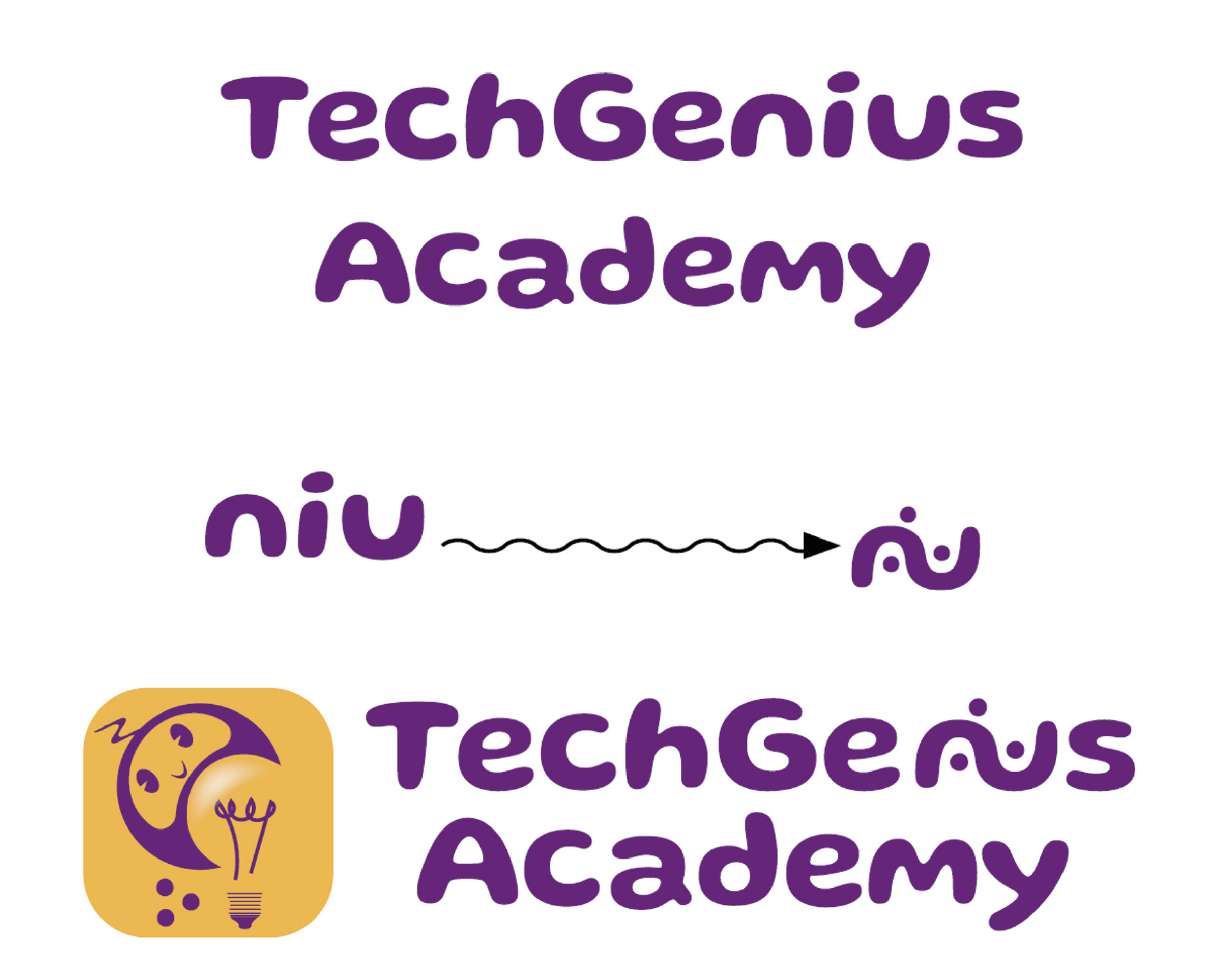
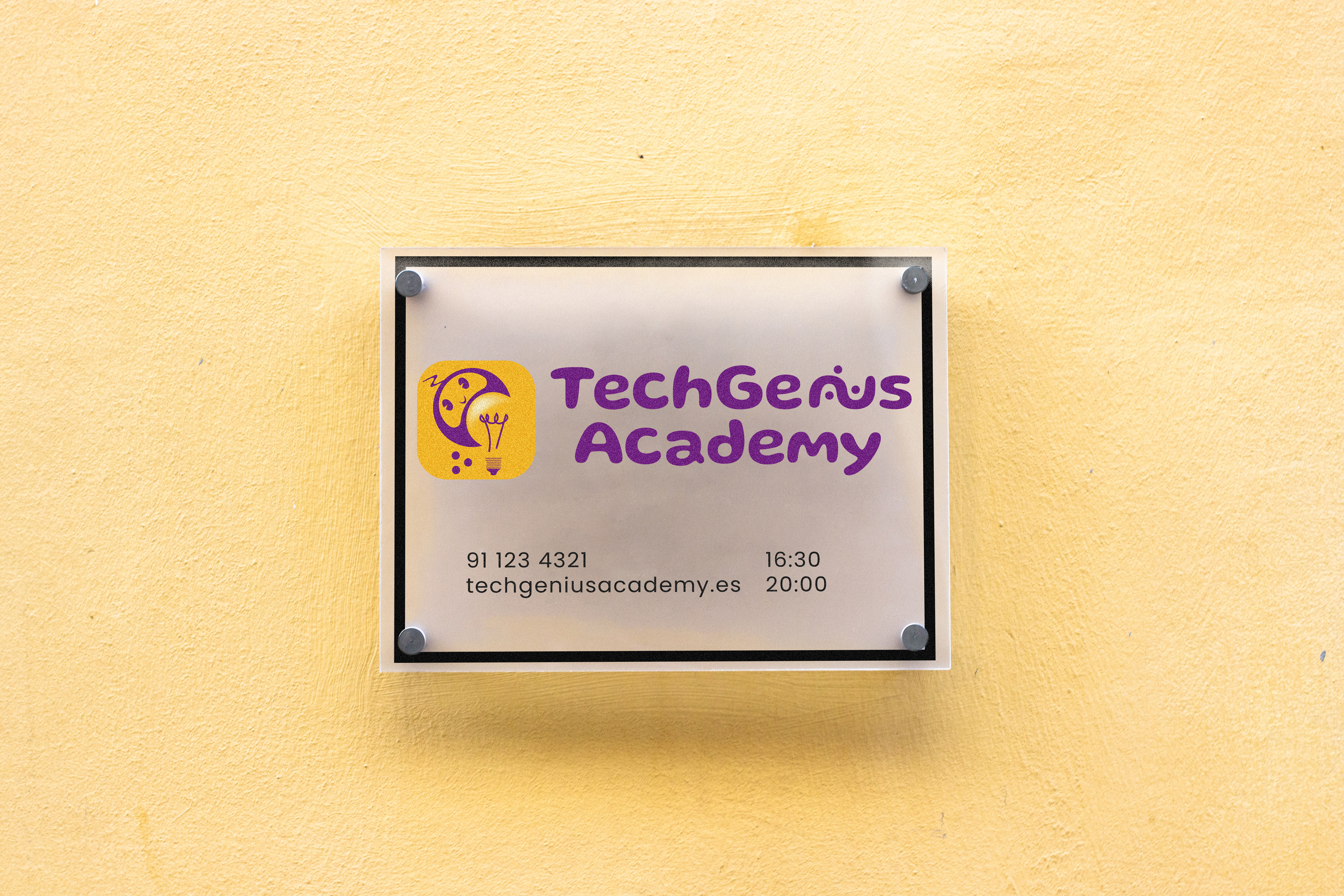
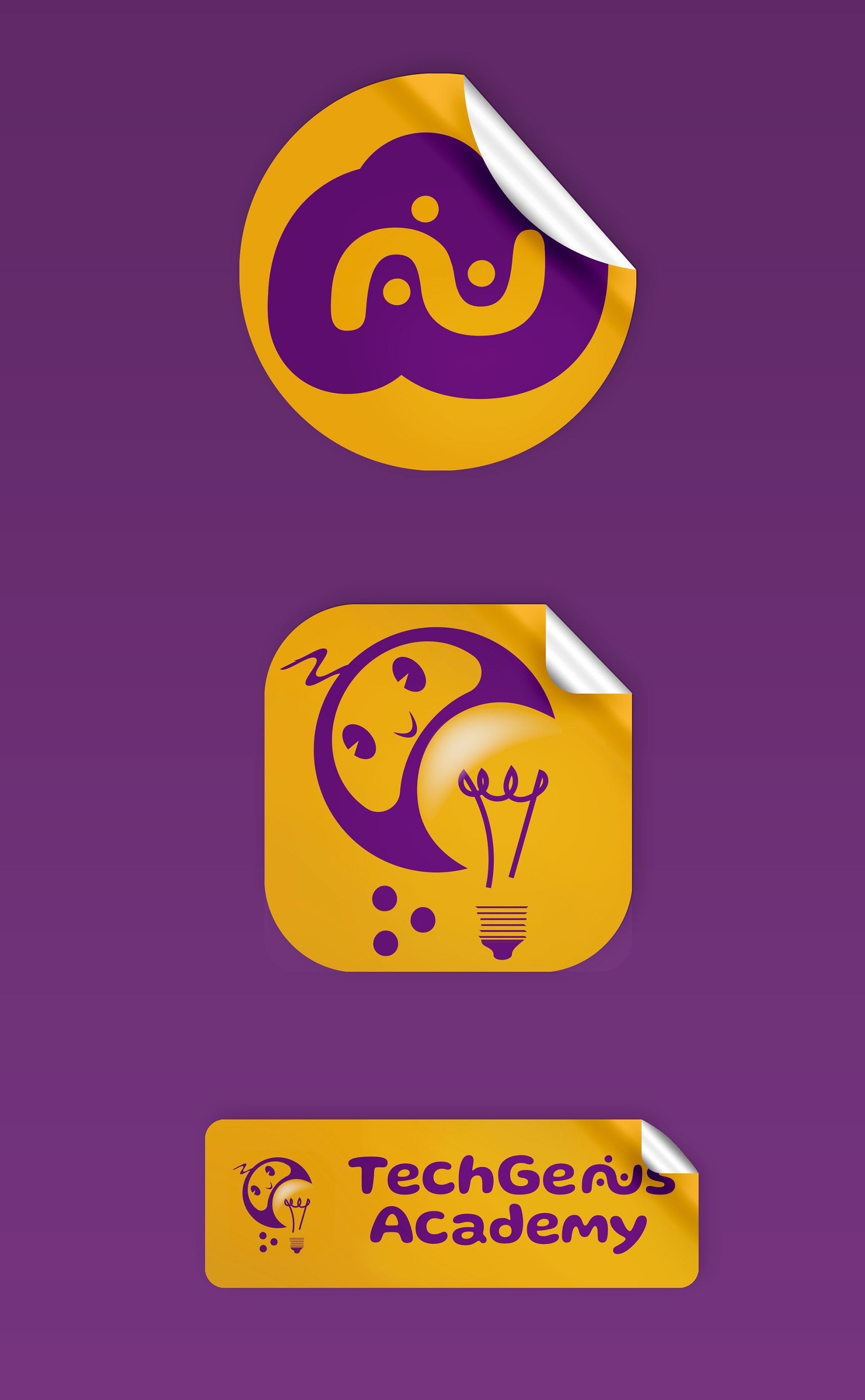
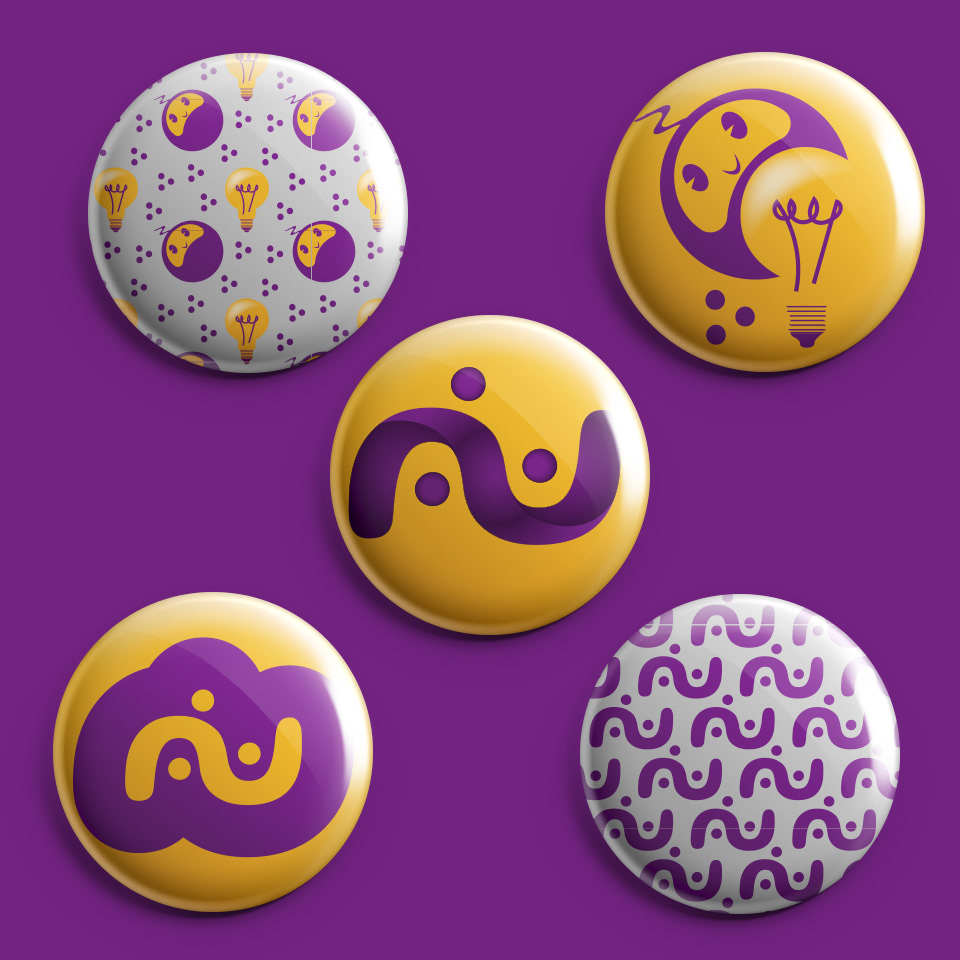
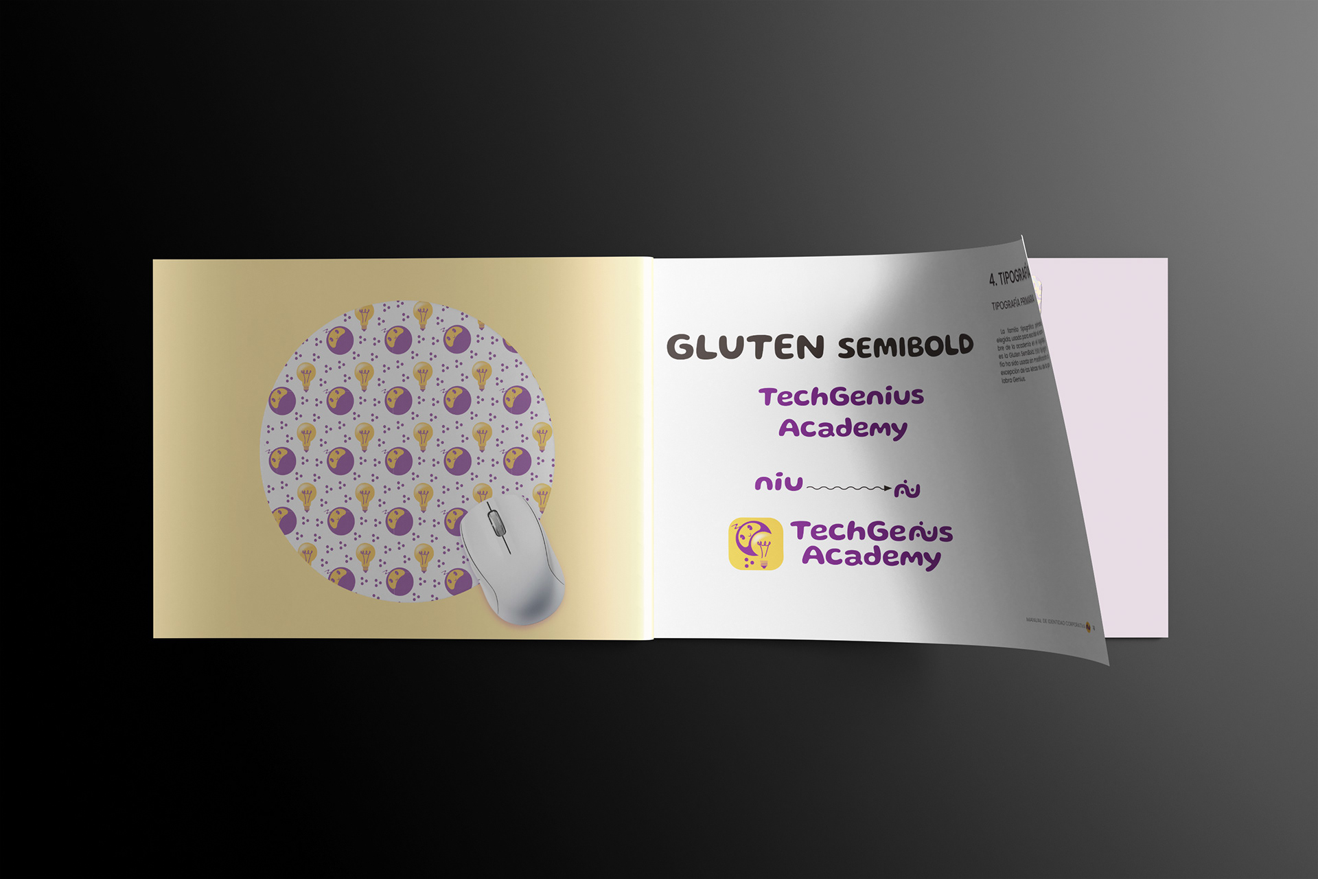
The first step for building the Corporate Identity was building the logotype. This was a process that took about two weeks of sketching possibilities. The brand wanted to combine creativity with technology so I finally came out with the idea of using a little robot mascot with a light bulb.
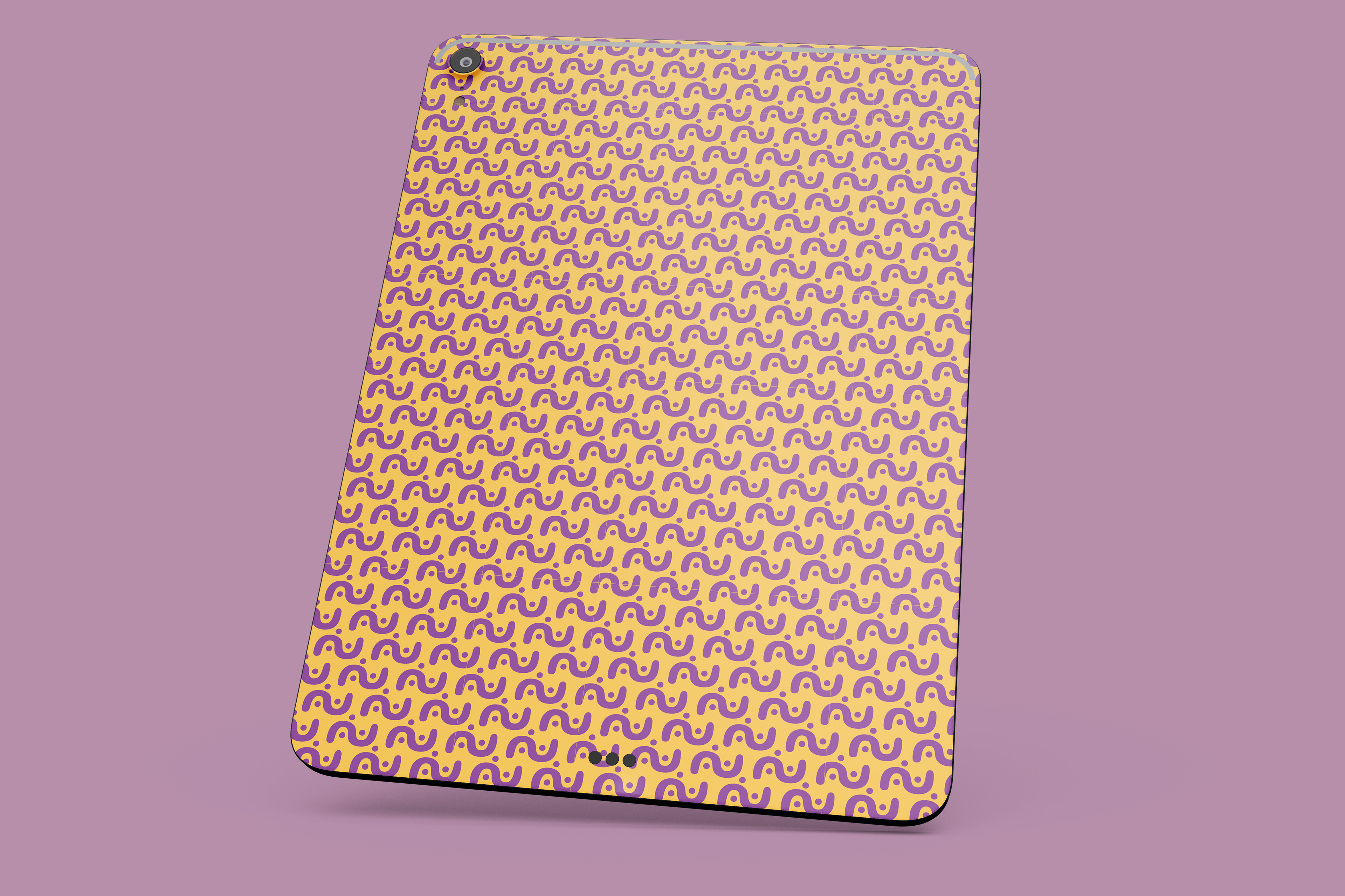
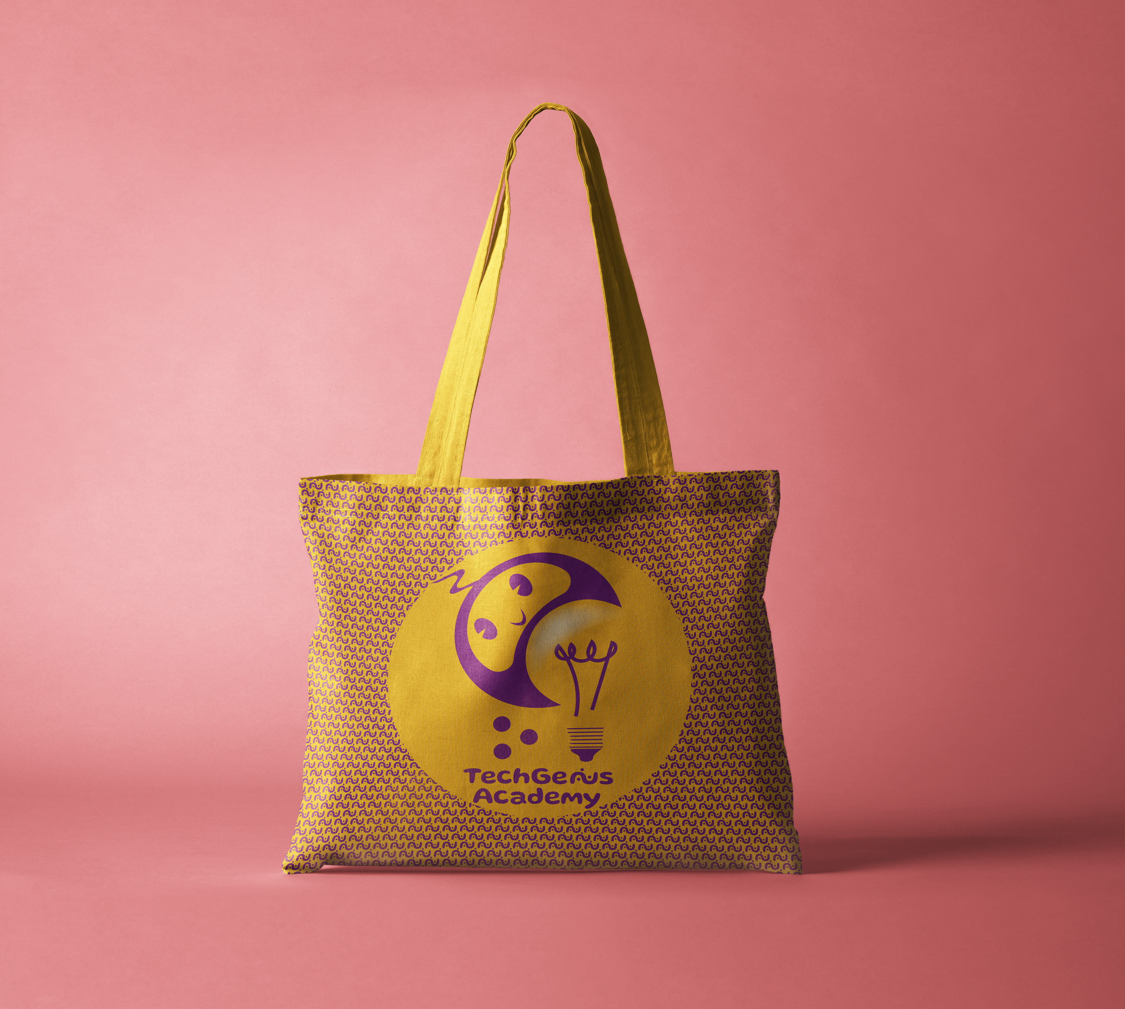
The brand also mentioned about dinamism and science so I decided to make the letters "niu" of the word Genius together and added 3 circles to imitate 3 electrons around a nucleus.
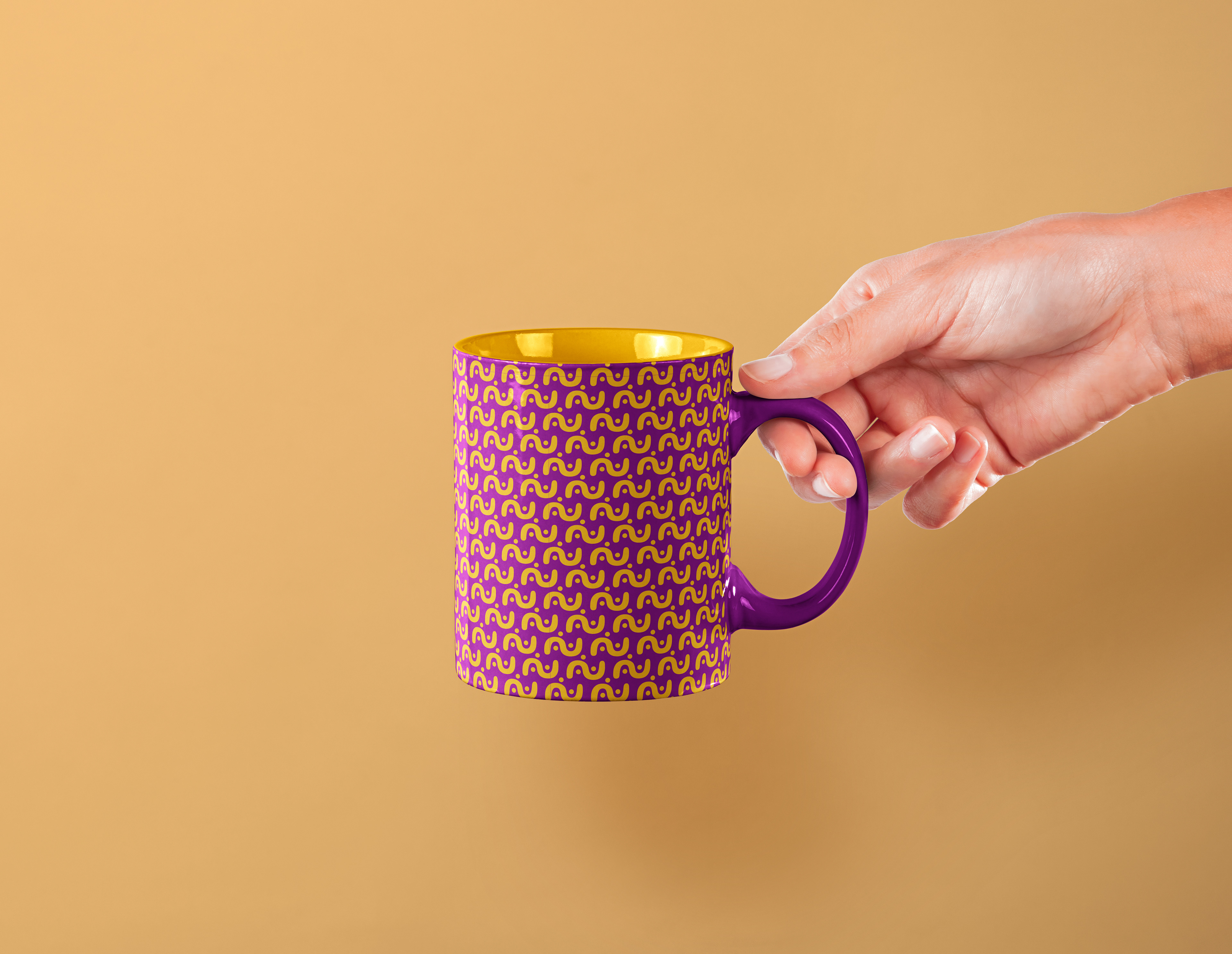
I used the colors purple and yellow for the brand because they are bright and bold without being too childish. I think these colors match the ages closer to biggers kids and teens.
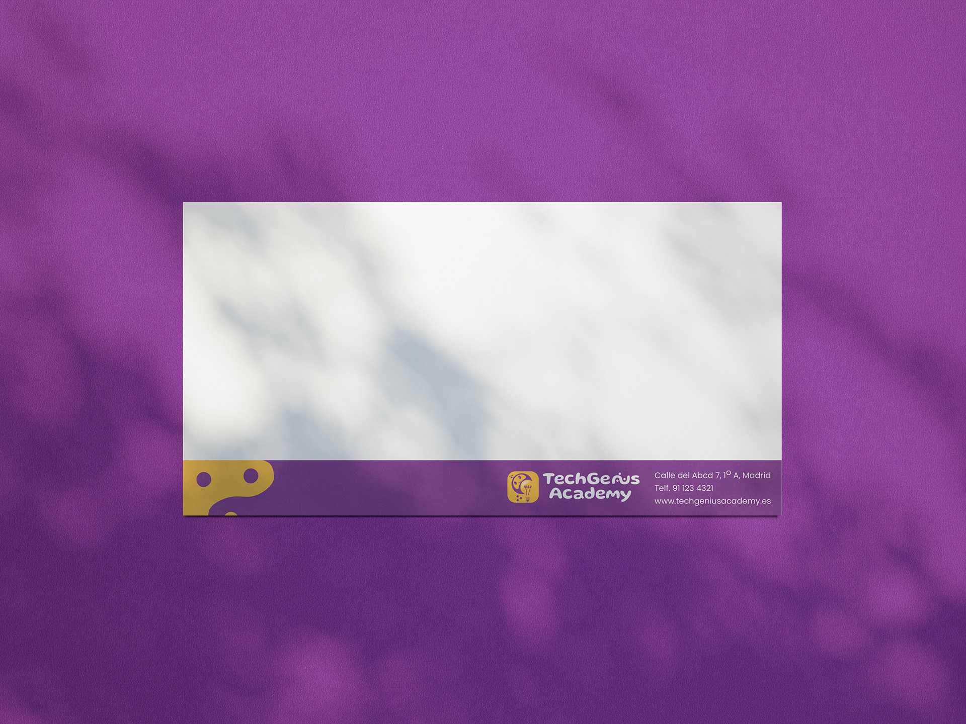
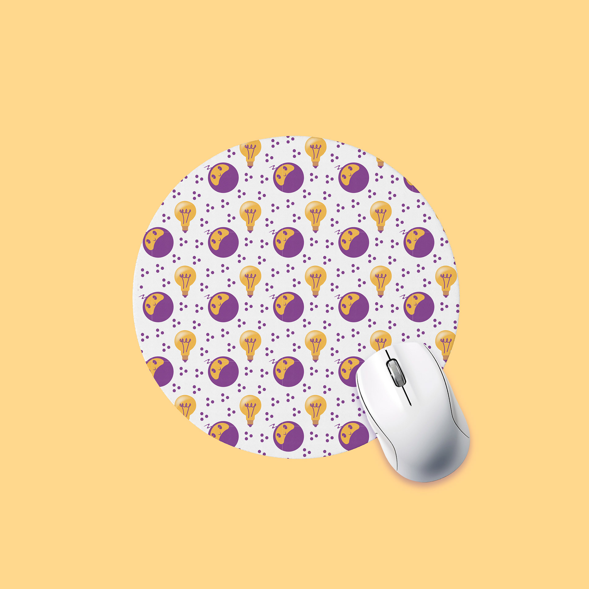
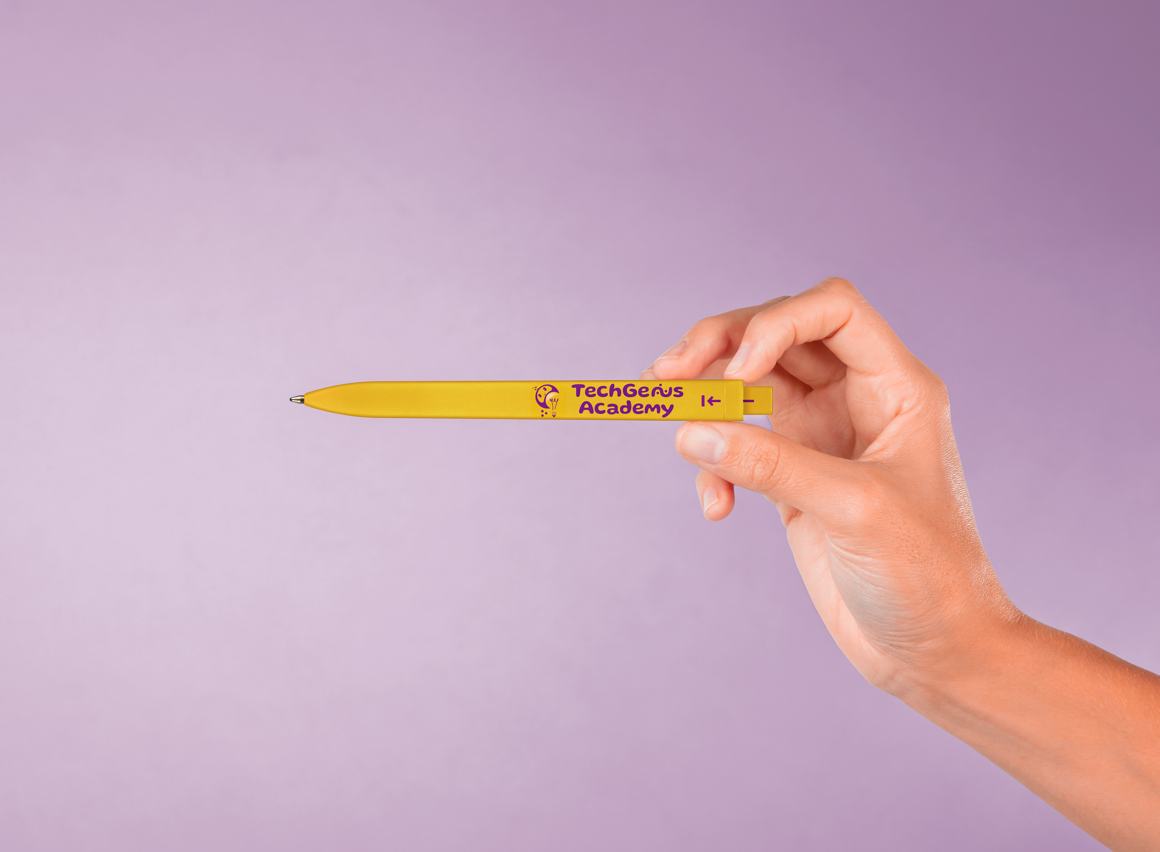
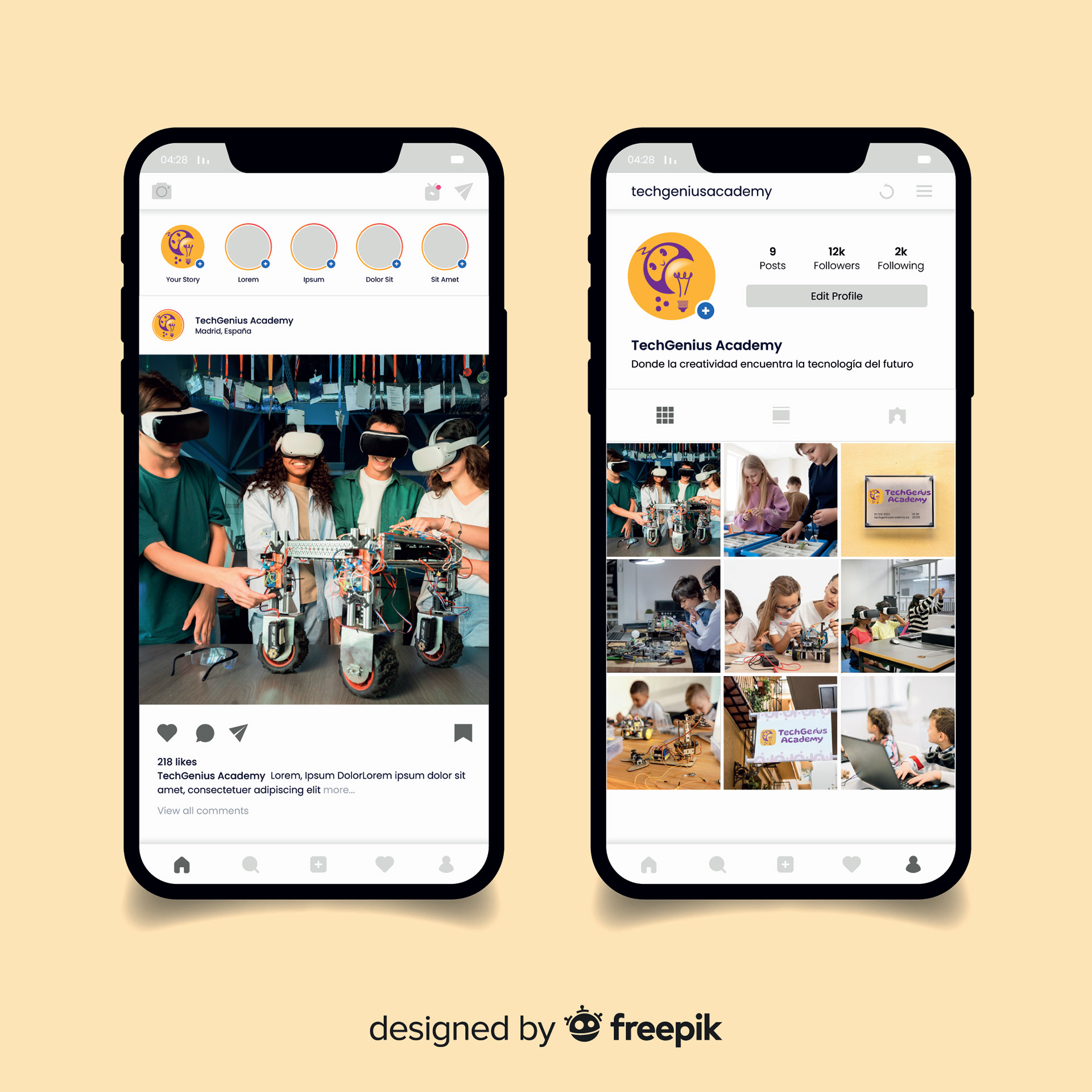
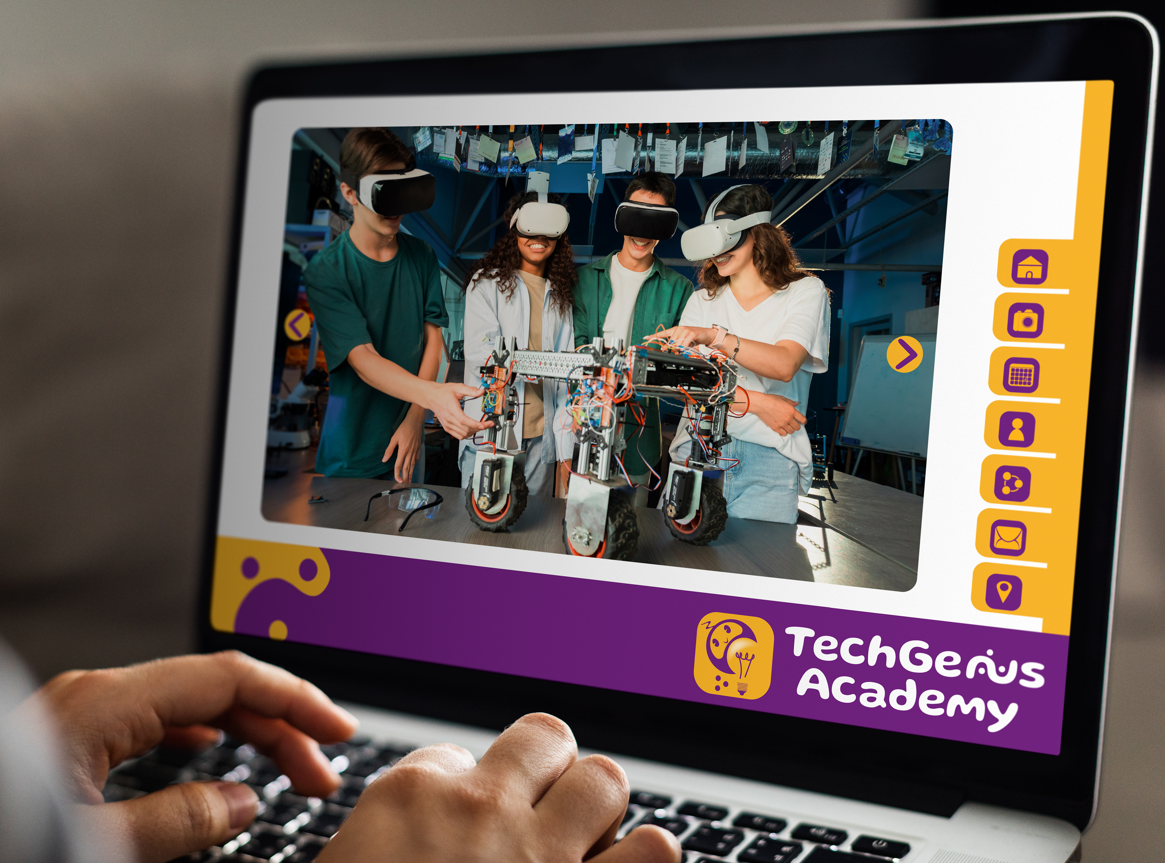
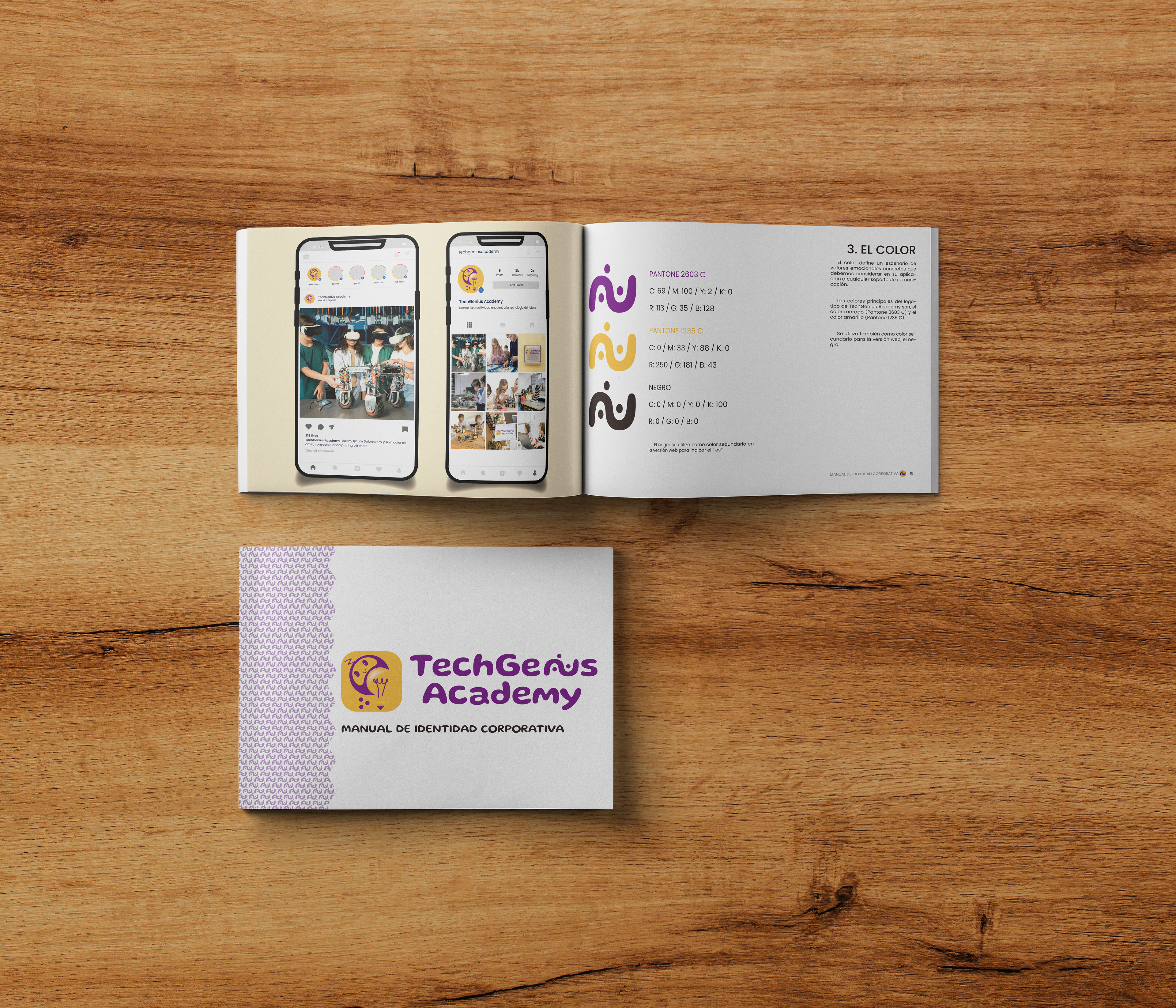
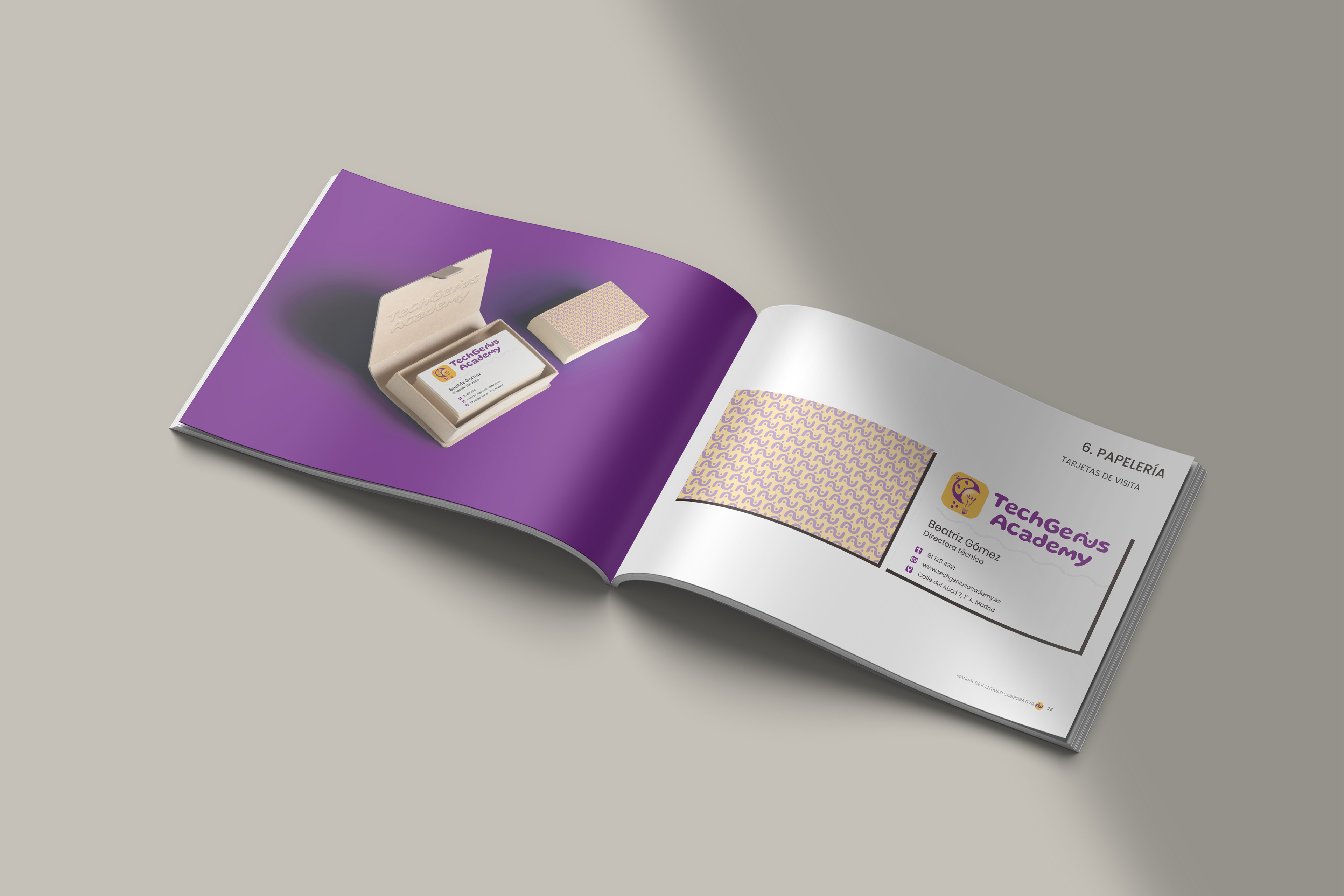
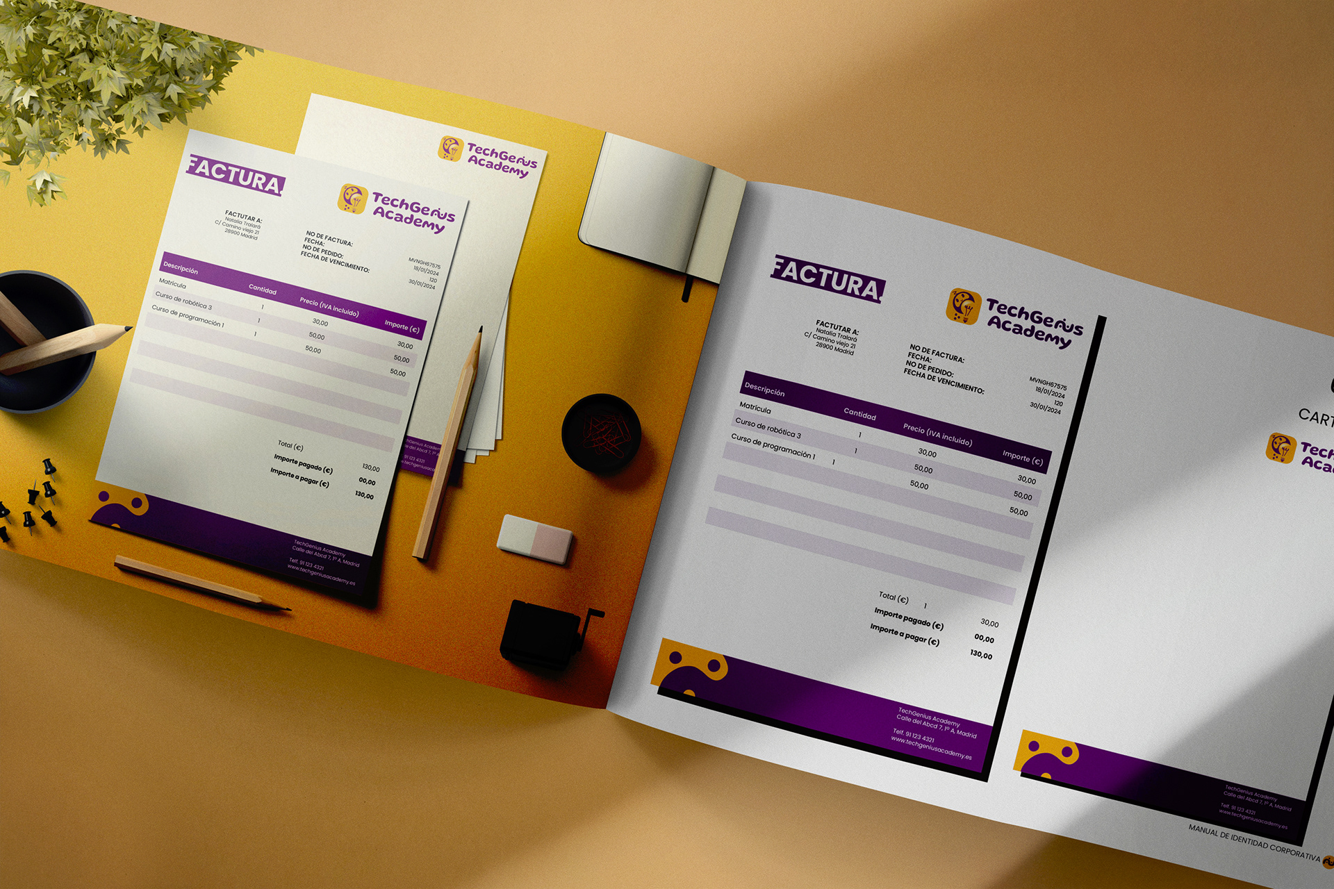
The fictitious client wanted to have also the Corporate Identity for the brand, and wanted to include stationary for brand internal and external uses and other possible applications for the brand.
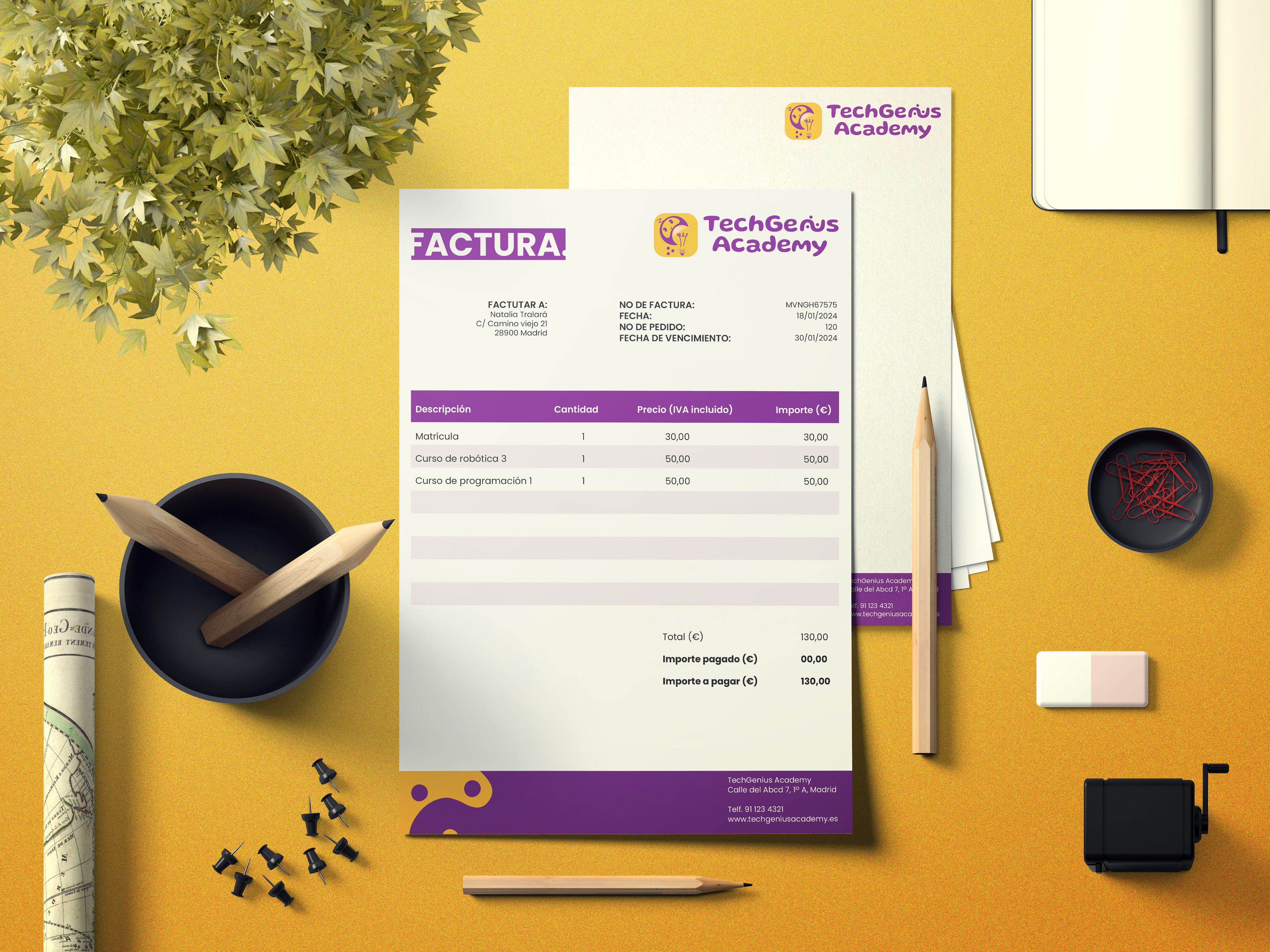
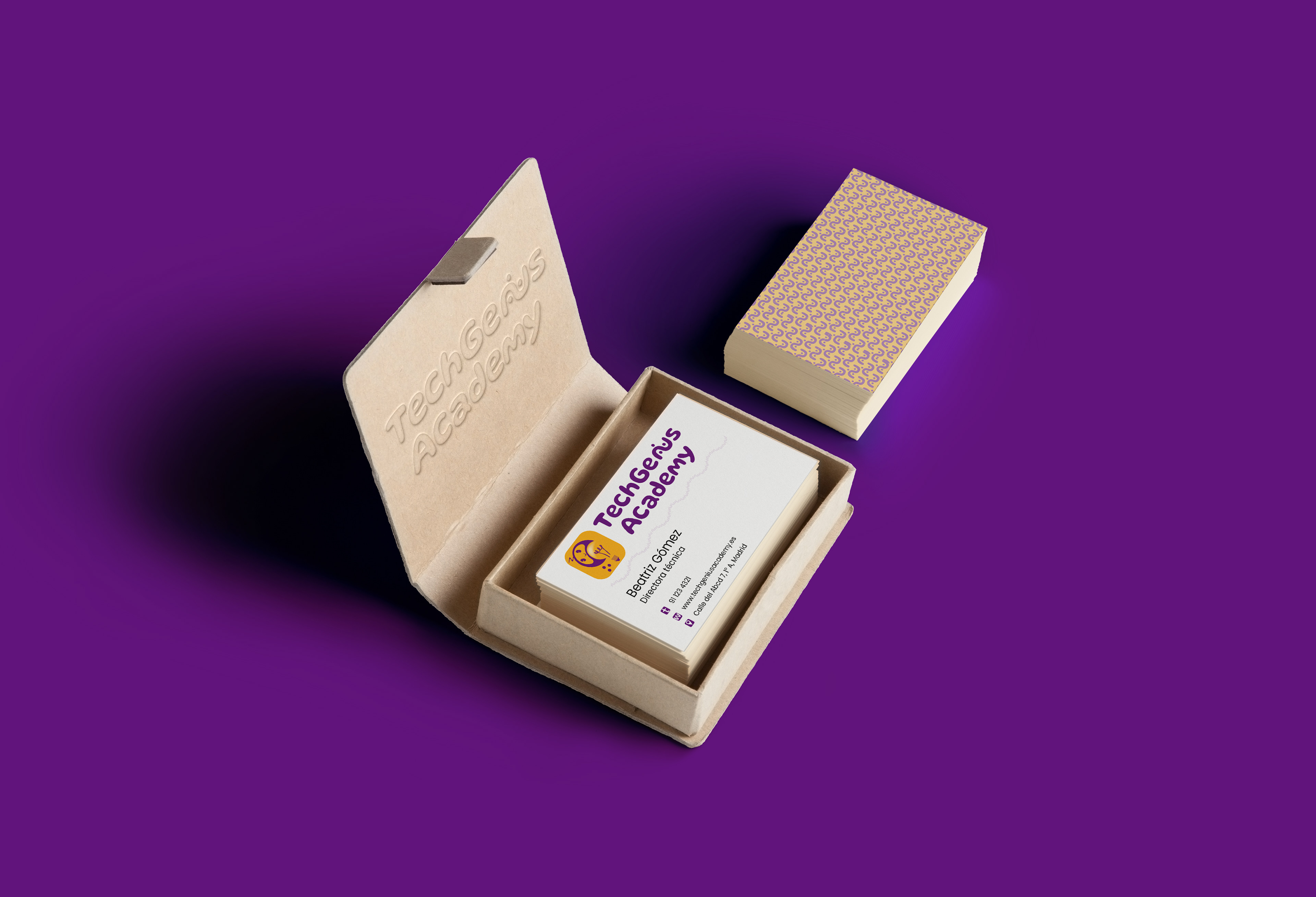
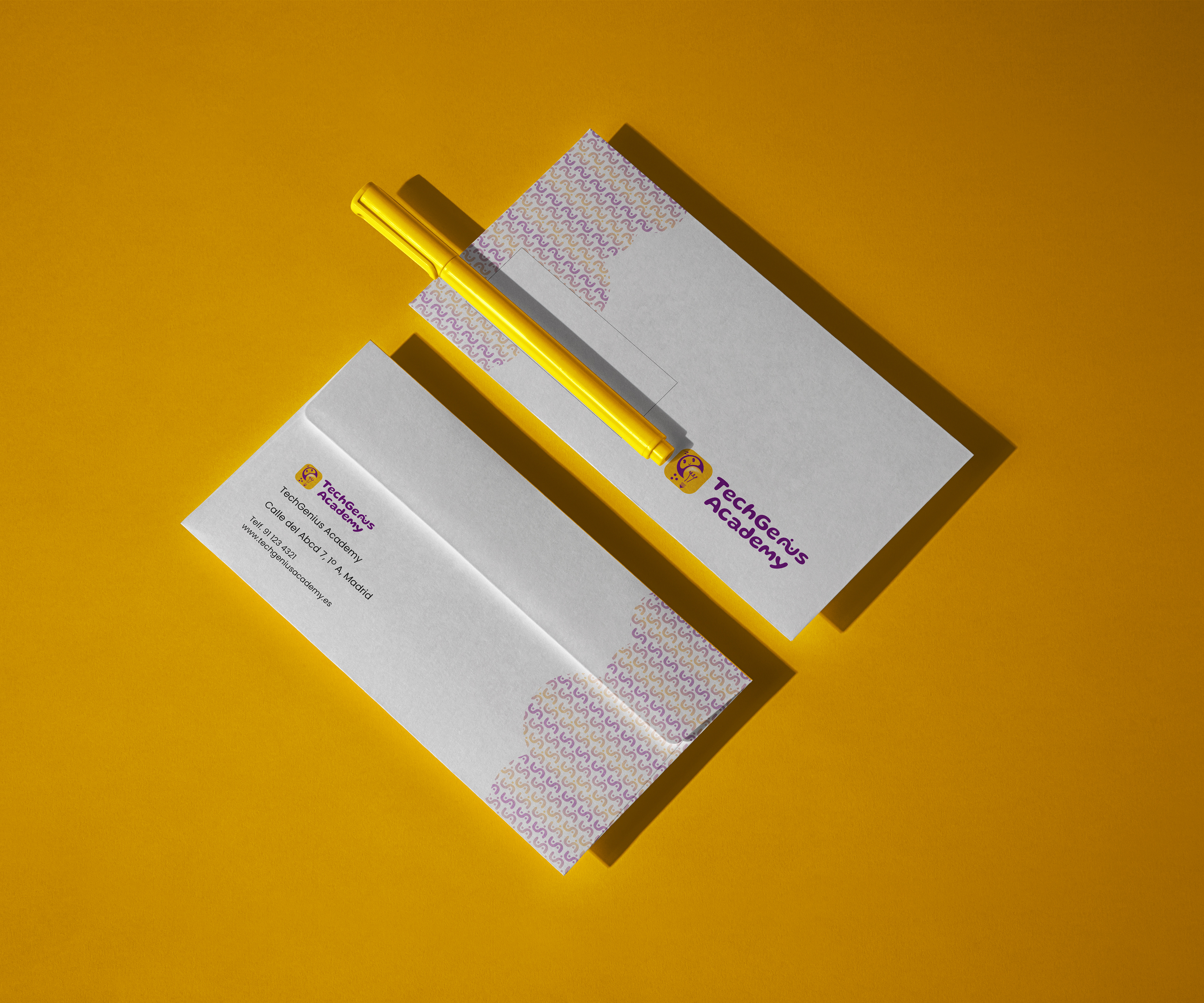
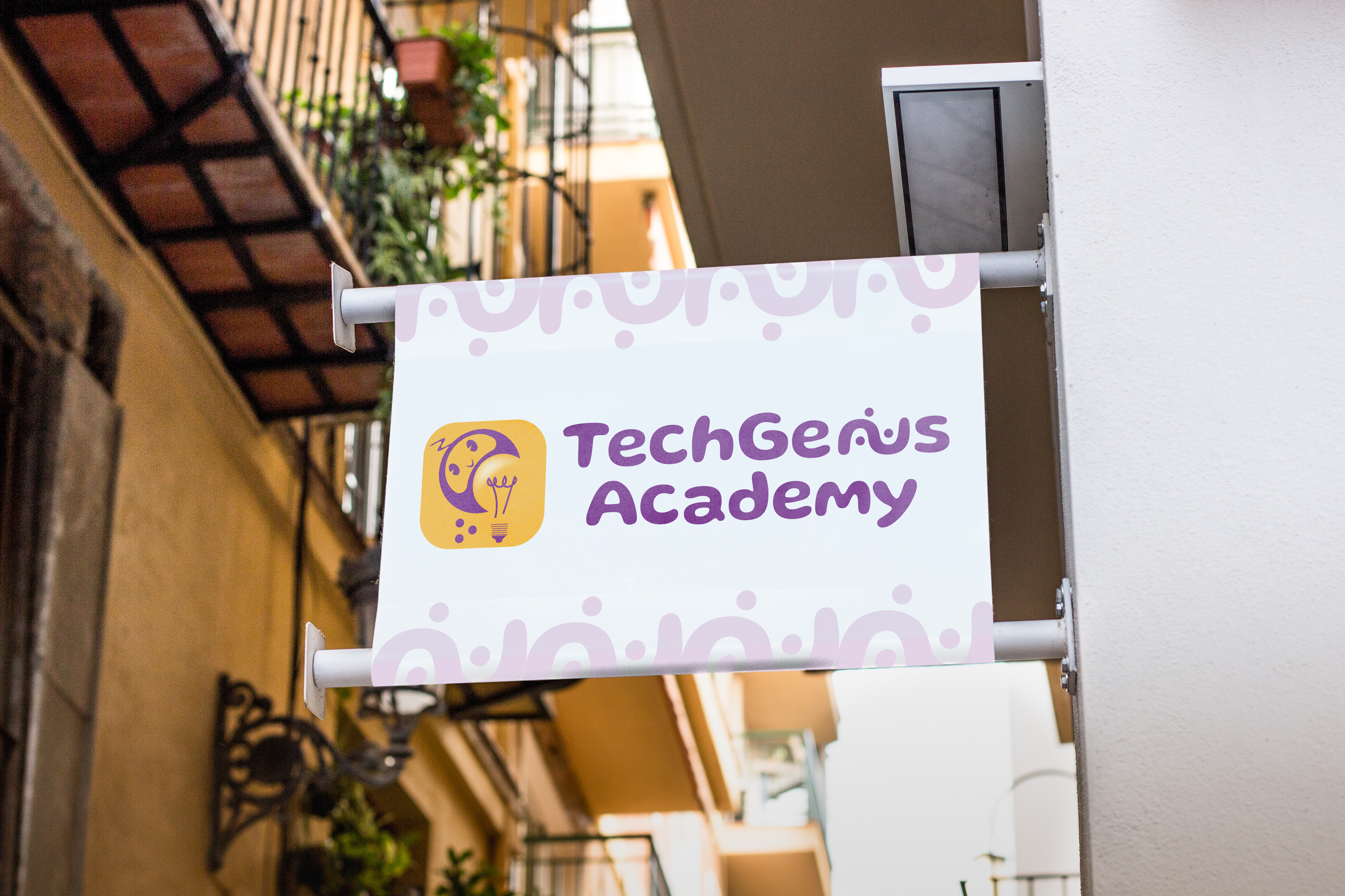
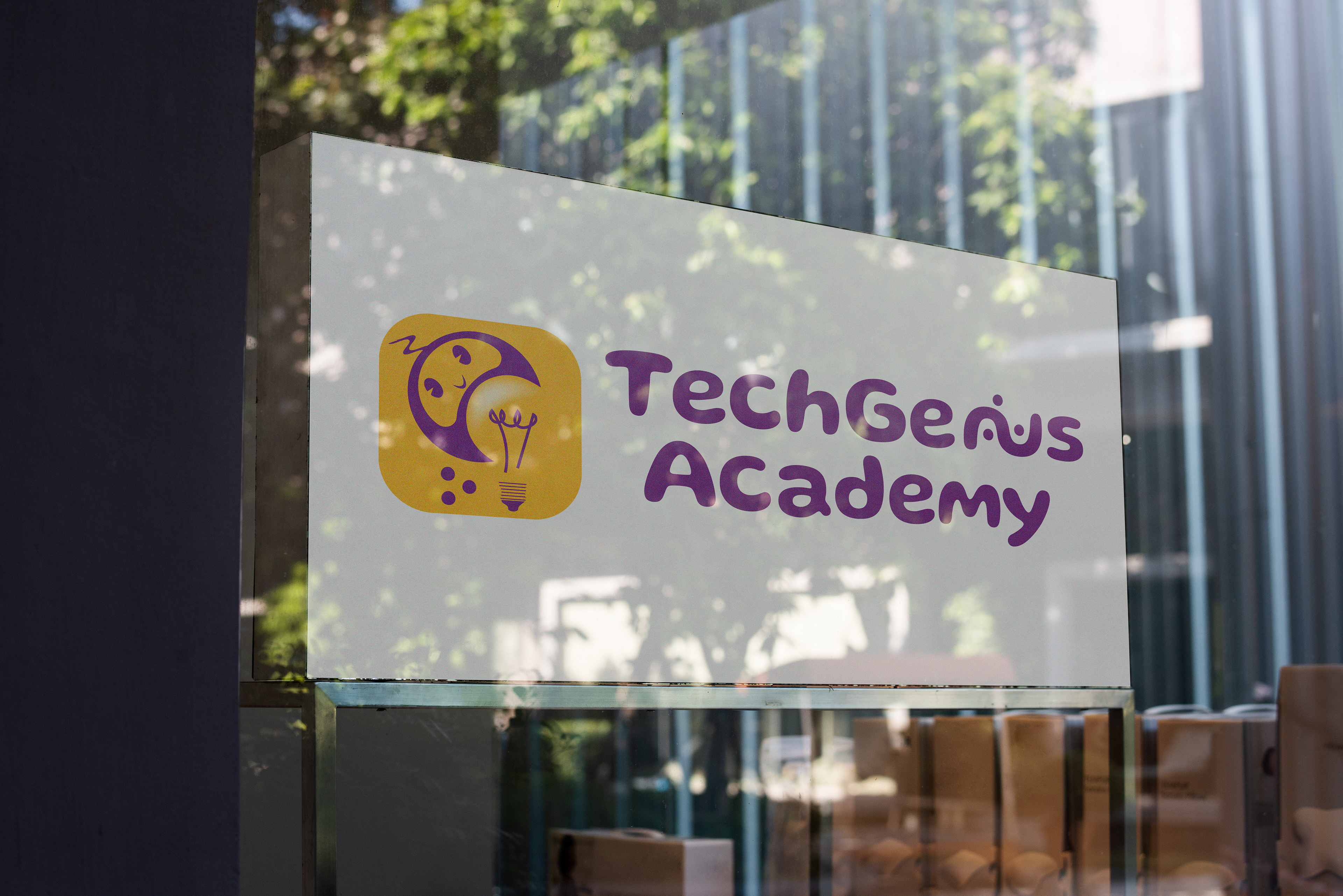
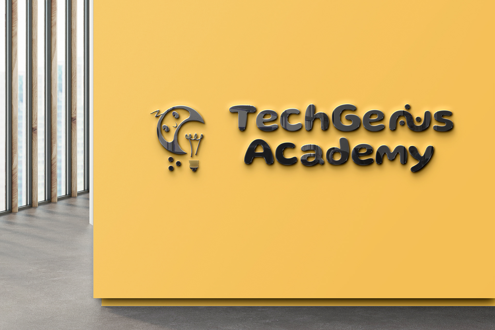
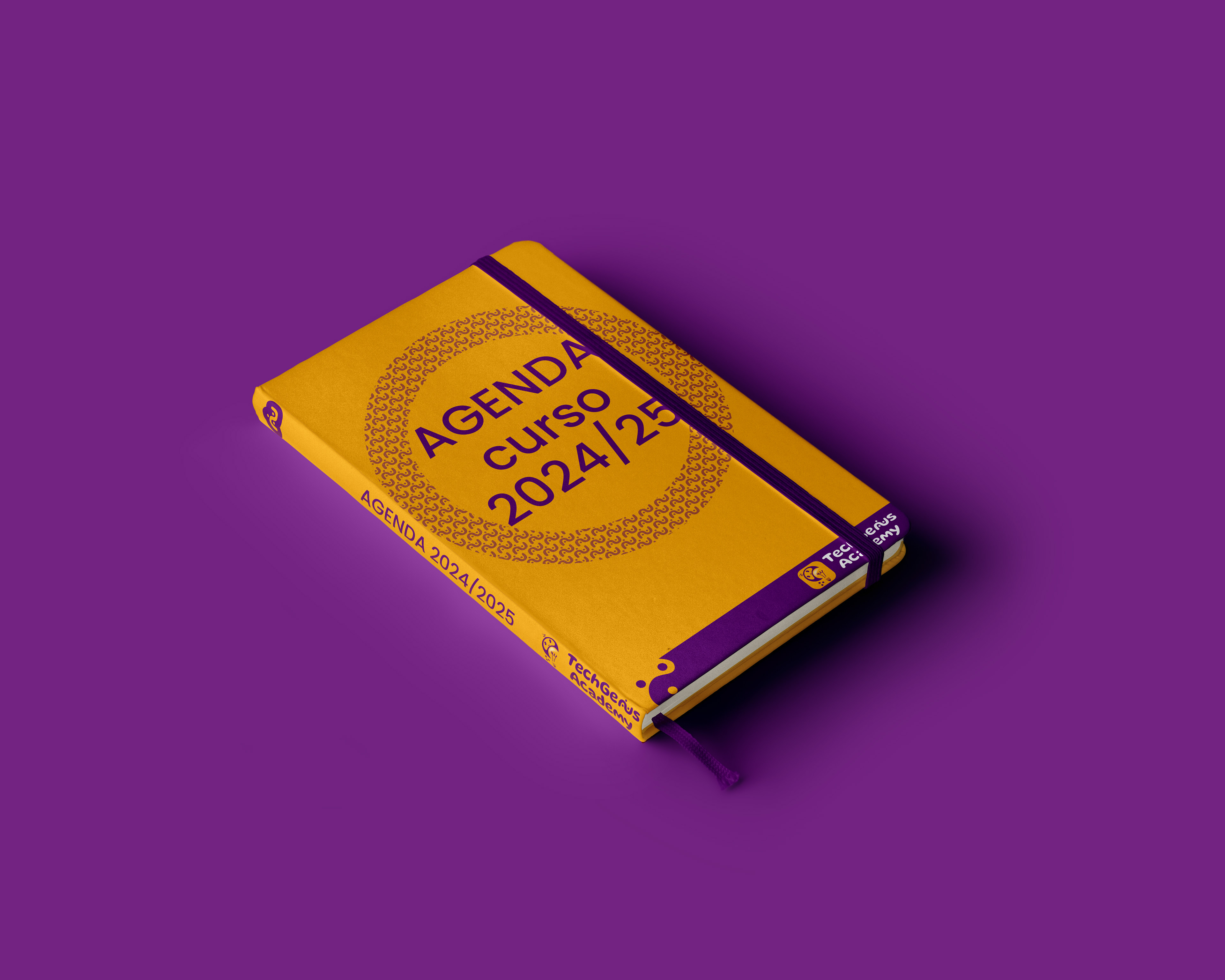
Following, a few examples of how a printed version of the Corporate Identity Manual, to have an idea of how it would look like.
Finally, I made an amateur animation of an example of what the logotype would move. Just as a beginners experience.
This project was a lot of work, but it was very interesting to build a whole image from scratch. I am looking forward to being part of other projects involving logotype and corporate identity creation in the near future.